Langdon
29th July 2020
Yaki Yaki
17th May 2019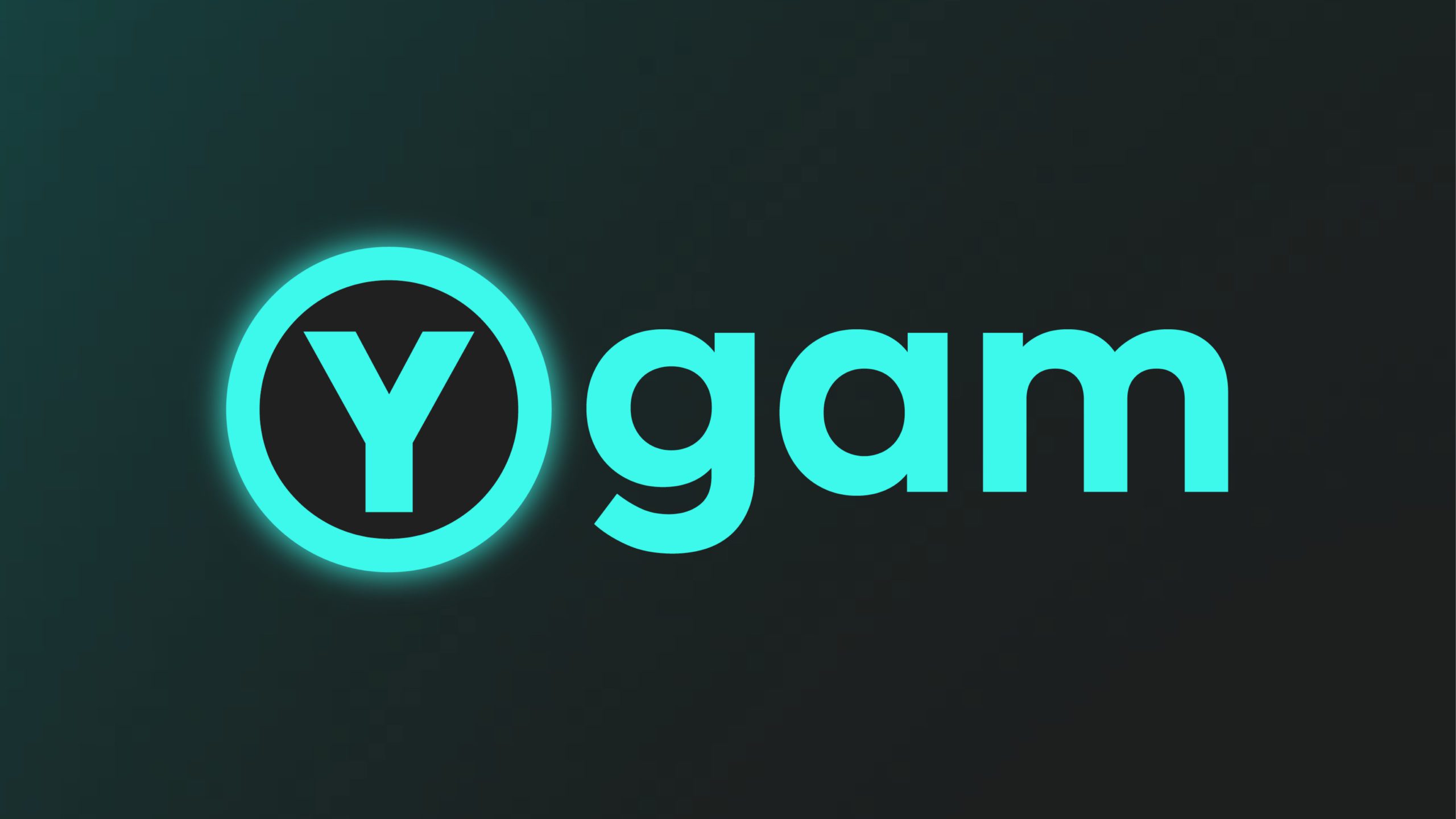
Ygam is an award-winning British charity working to protect children and young people from experiencing gaming and gambling harms through awareness raising, education and research.
Founded in 2011, Ygam was established to provide free training and resources for educators, youth workers and health professionals, to enable them to identify and address gambling harm in young people. Ygam’s remit has since expanded to include harm and addiction related to mobile and online gaming. As a result, the brand no longer reflected the core focus of the organisation, nor did it resonate with a young target audience more familiar with digital/gaming imagery. The client felt that their branding felt out-dated, ‘shouty’ and needed to better represent their work and service users, whilst also retaining a sense of trust with parents and government ministers.
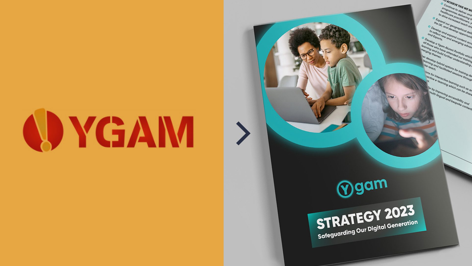

There were other challenges to address:
- People struggled to say the organisation’s name correctly (usually as a ‘Y-G-A-M’ acronym) rather than with the intended sound of ‘why-gam’ – with ‘gam’ alluding to gambling and gaming. The previous block caps lettering didn’t help this.
- Although the branding style and colour palette was once considered ‘disruptive’ within its sector, the brand had since lost its edge and distinctiveness.
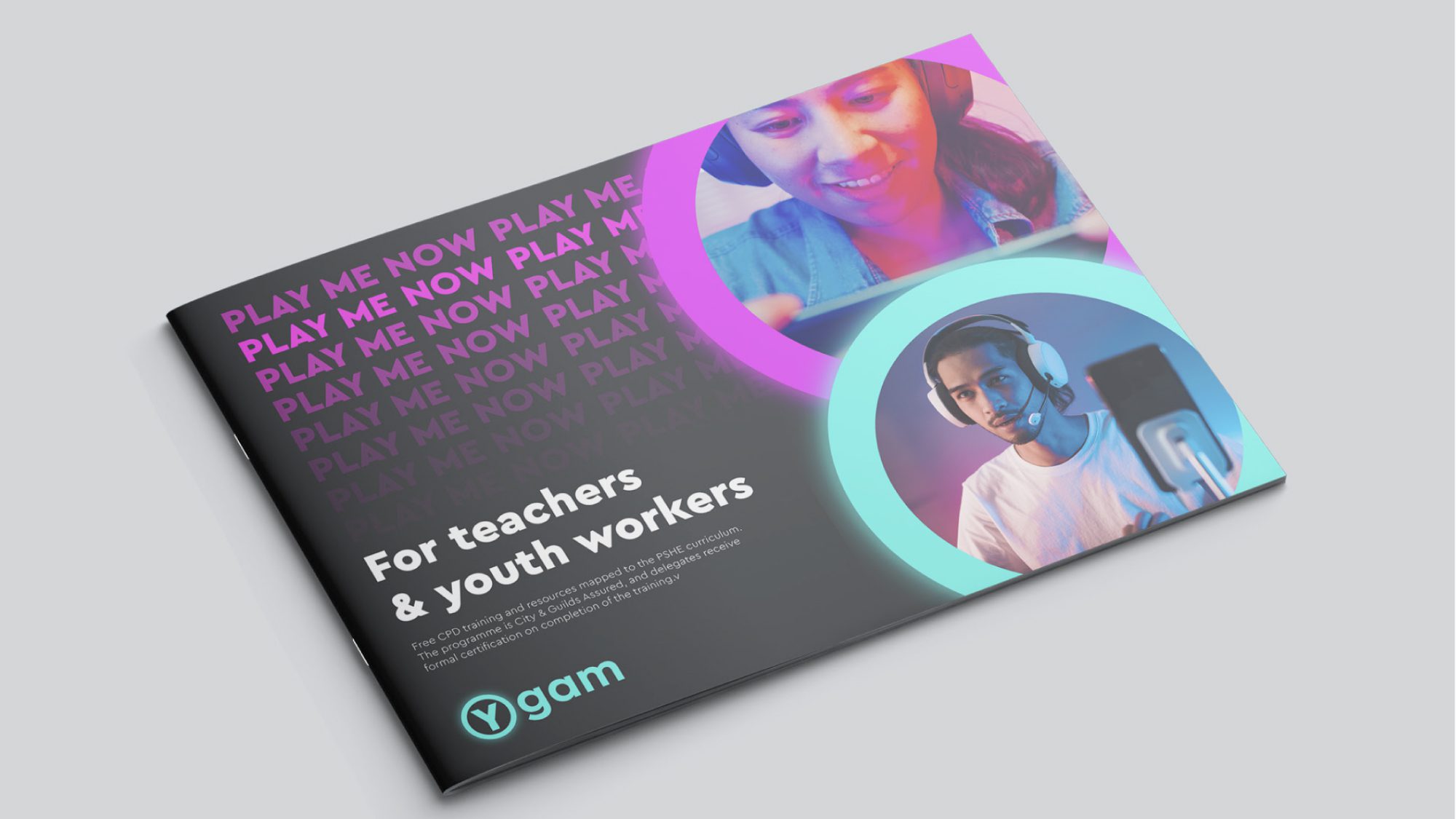
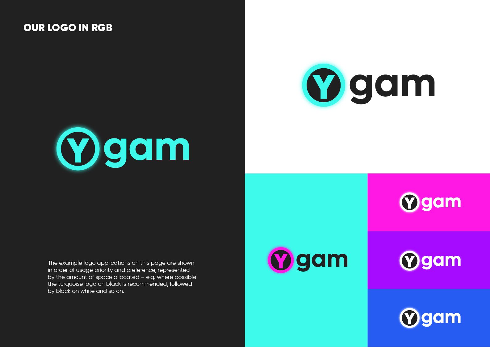
The new brand identity that we created addressed the above points by introducing a more digital and gamified visual language, utilising a bold new colour palette. In addition, we capitalised only the ‘Y’ of the name and separated it from the lowercase ‘gam’ so that it now reads as intended.
As well as responding to the technical requirements of the brief, there is a strong idea underpinning the brand identity. The design of the new logo represents three things:
- The organisation’s core Youth emphasis (by separating the Y and placing it in a circle)
- The Y in the circle is reminiscent of a Y button on a game console controller
- The glow surrounding the circle represents the ‘always-on’, compelling and seductive nature of digital gambling and gaming, and the blurred lines that exist between them.
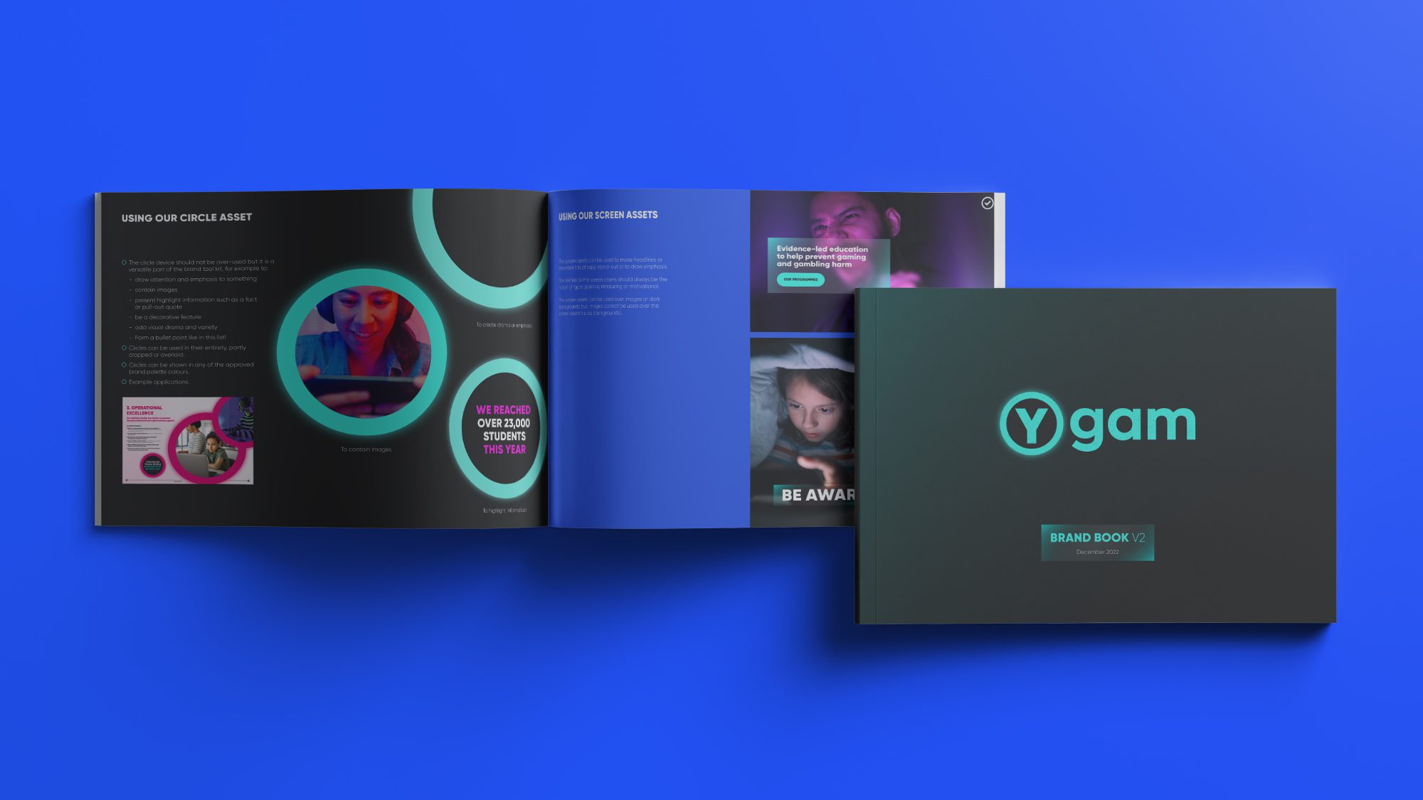
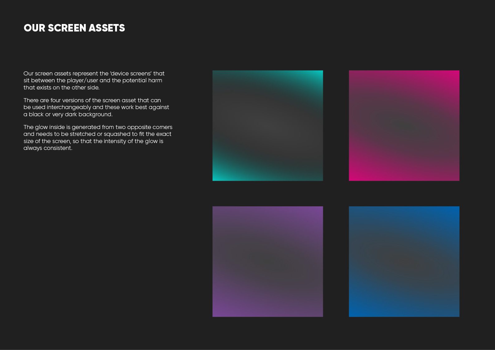
In addition to the logo, we created other brand assets including the circle as an image holder or device for emphasis, and a blurred, frosted image asset for headlines, to represent the potential danger lurking behind digital screens.
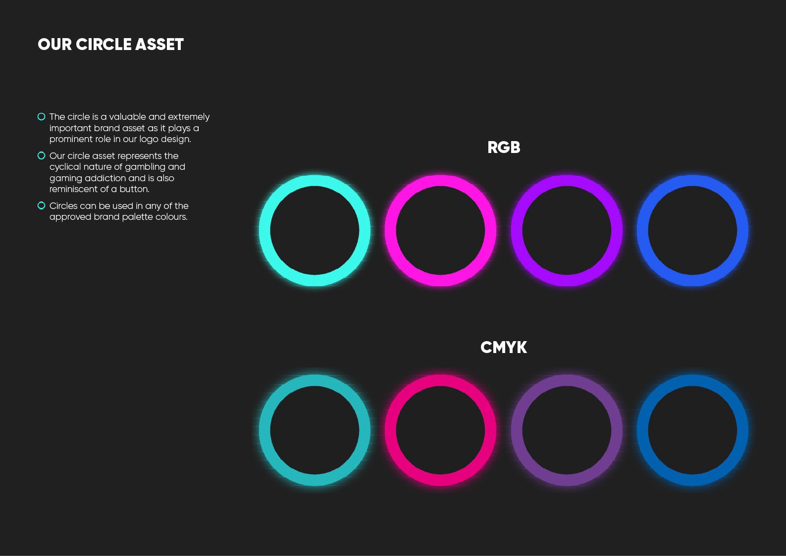
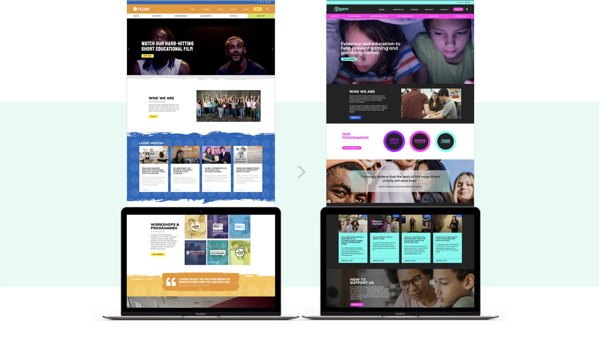
We undertook workshops with stakeholders and developed a range of routes which were tested with core focus groups. We created a detailed brand book, a launch strategy document and material for their relaunch event that took place at the Houses of Parliament in January 2023. In addition we undertook a website re-skin, simply taking their previous WordPress website and overlaying the new brand style, fonts, colours and assets. This is an interim website whilst a new digital platform is developed.
Daniel Bliss, Director of External Affairs at Ygam said: “We have received nothing but positive feedback on how our brand now looks and feels. It has been incredibly well received by our staff, stakeholders and the teachers and professionals who use our resources. Full credit to your team for how you approached this difficult project and achieved such impressive results in the super tight time frame. It’s evident that your vision was spot on.”
