Tart Modern
17th May 2019
Clap For Our Carers
9th April 2020
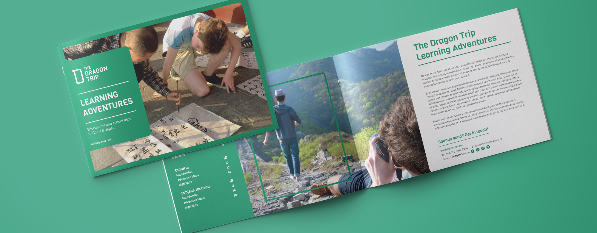
The Dragon Trip are pioneers and leaders in budget tours to Japan, China and Southeast Asia. With ambitions to become and remain the number one brand in the travel sector, they appointed Creative Clinic to undertake a full rebrand and overhaul of their marketing communications.
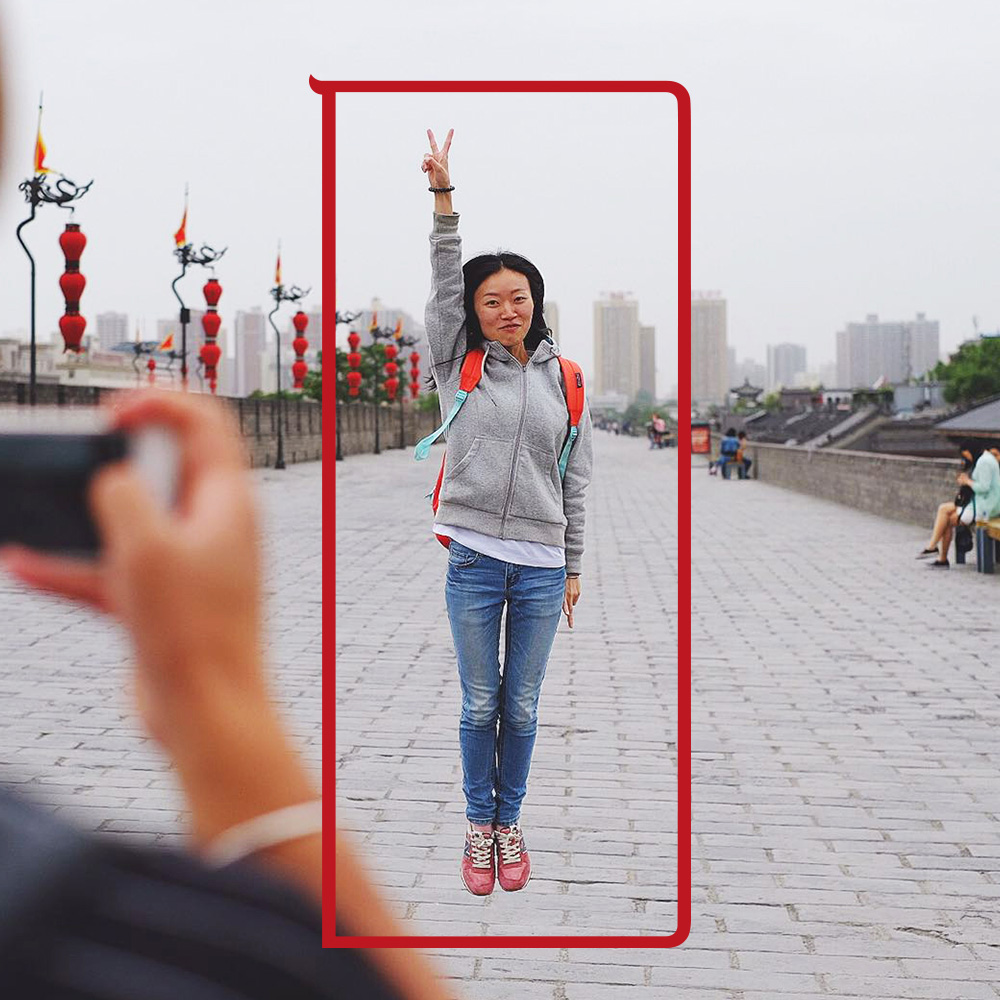
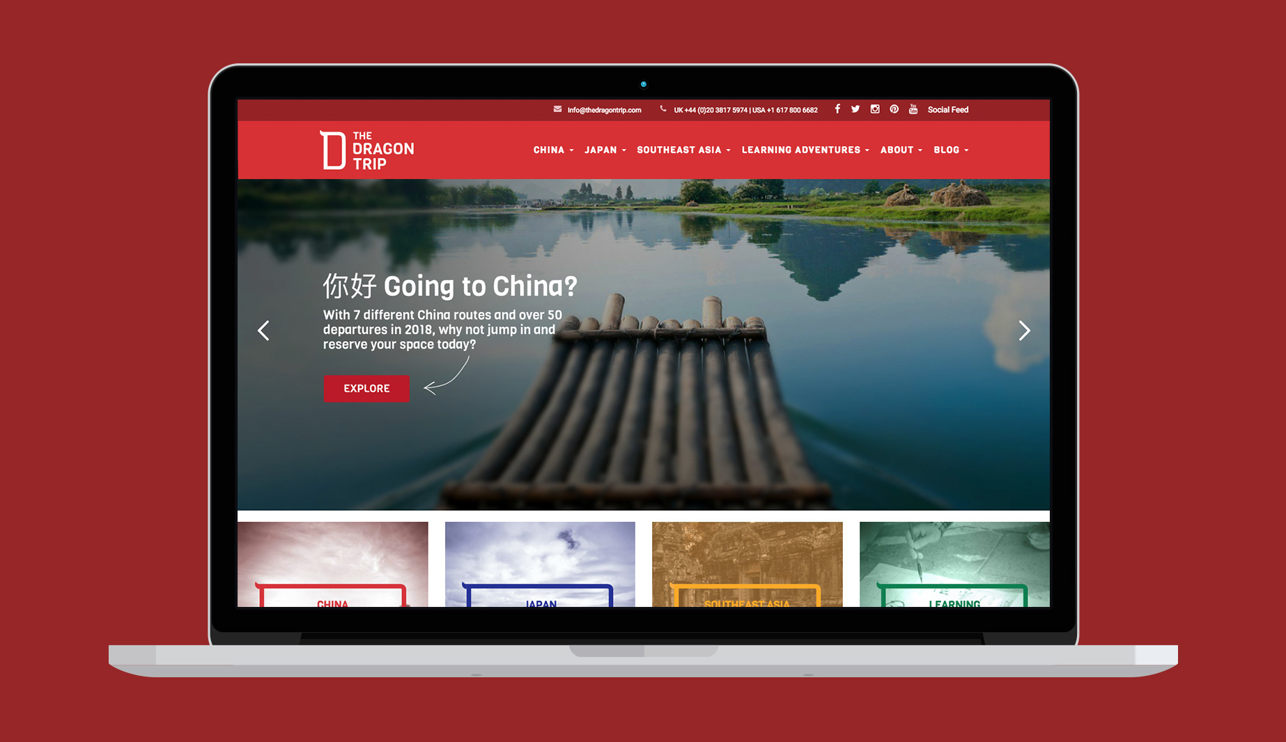
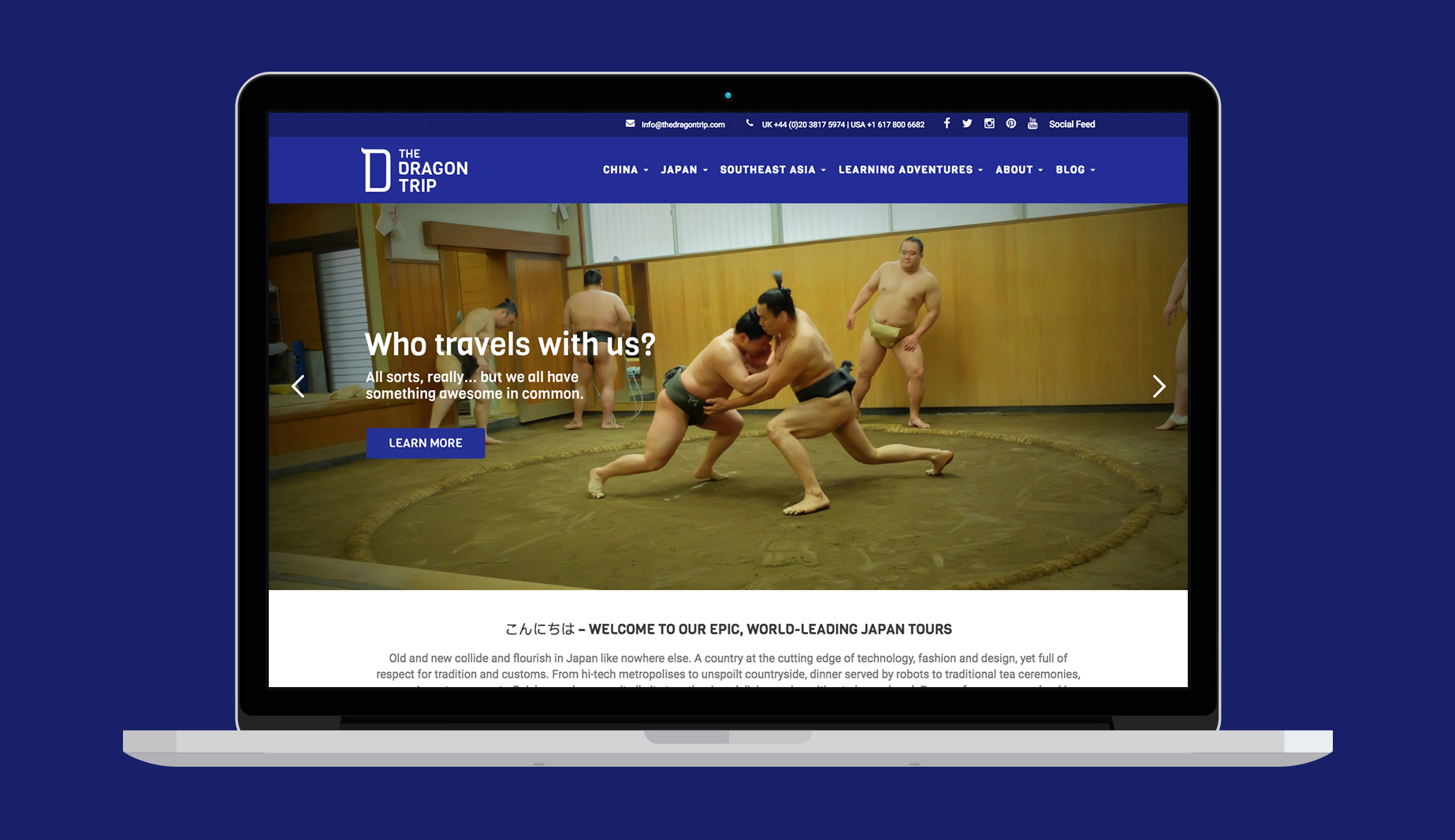
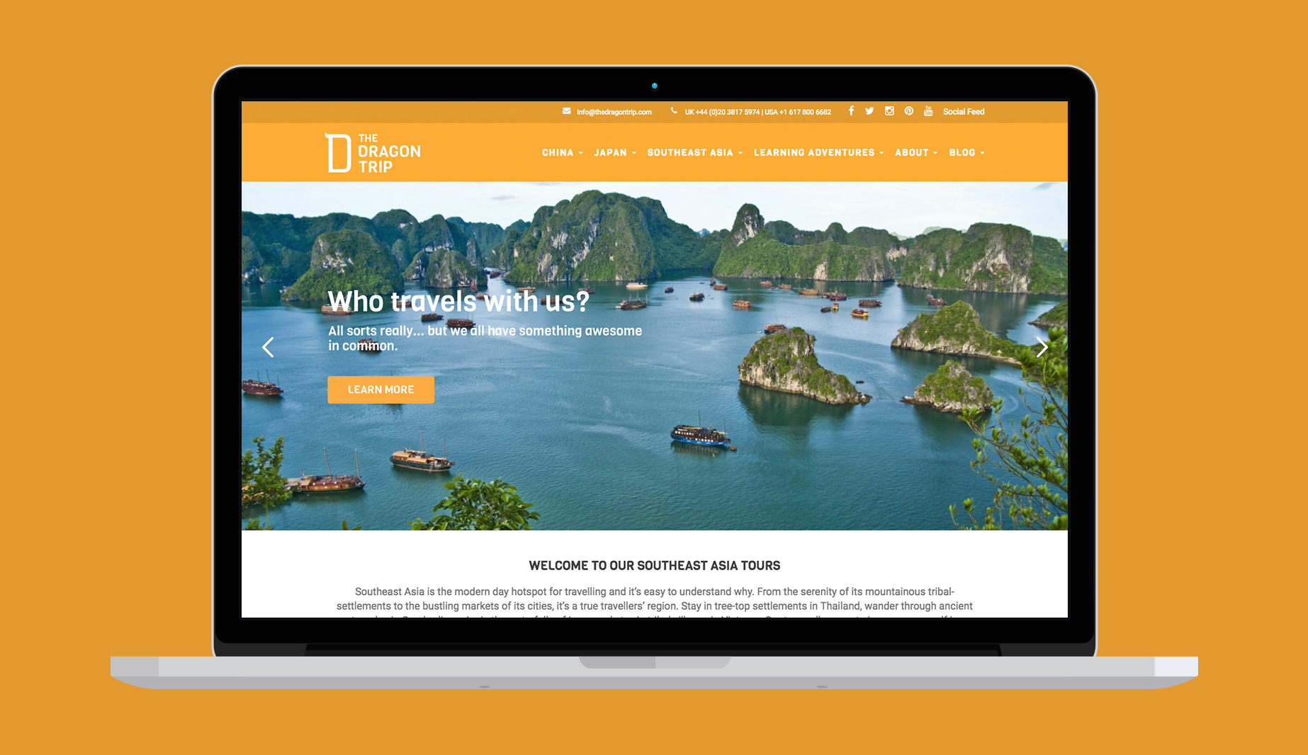
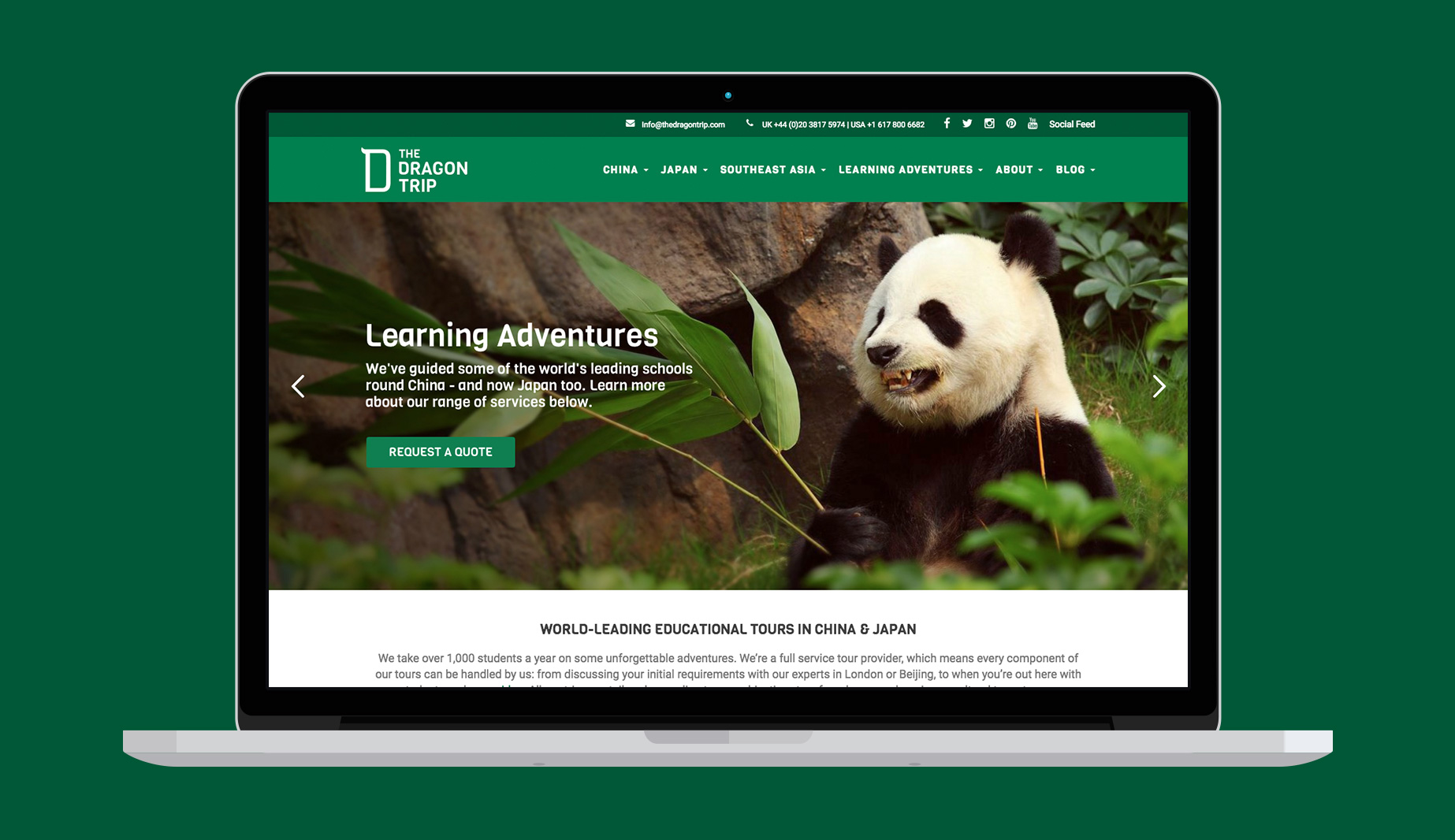
The first task was to create a new logo and defined colour palette to differentiate the destinations covered. The logo includes a distinctive ‘D’ symbol designed to evoke a dragon connection without defaulting to clichéd illustrations. This symbol also works with the regional inspired colour palette to act as a ‘frame’ and ‘highlight’ on images.
After establishing the brand style we then redesigned and rebuilt their existing website to simplify the navigation and user journey, and also to provide an improved mobile experience. A new brochure followed.
