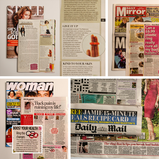
Product launch causes media frenzy
30th October 2013
Finding ‘Mike’ finds The Creative Clinic
29th May 2014
Did you know that on average approximately 50-60% of web traffic 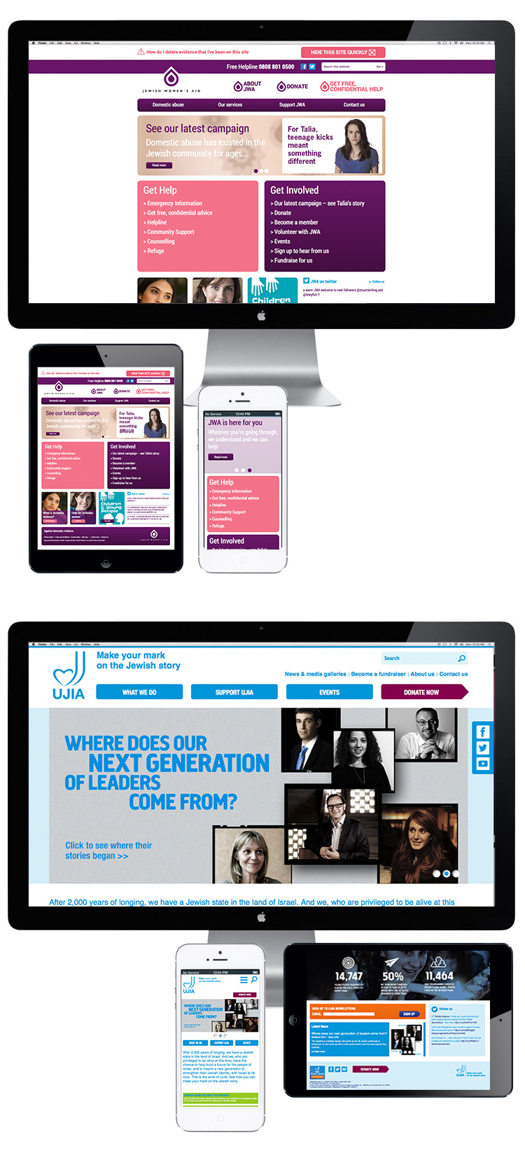
comes from devices other than desktop PCs?
That means smartphones, mobiles and tablets so if your website is not optimised for these devices than you could be losing vast amounts of traffic. They’ll probably see your site but find it hard to navigate on smaller touch screen devices and have to rely on manually enlarging page content and navigation. This just isn’t a practical way to view a site and so we have recently been going back to some of the older websites that we have built over the years and also been ensuring that all new sites are built to be ‘responsive’ to mobile devices.
A responsive website will adapt to best display the content on the screen size and platform of the device it is being viewed on. Navigation, layout and images will reformat to ensure they always look as good and are as easy to navigate as possible.
You can see some examples of responsive websites that we have designed below and which show how the same web pages reformat for each device. To find out more about making your website responsive please get in touch!