Norwood Dinner Reimagined
20th May 2021
The Mermaid London
5th February 2018
Following the successful merger of Ranger Services and CP Plus, two industry leaders in the UK parking sector, GroupNexus was formed.
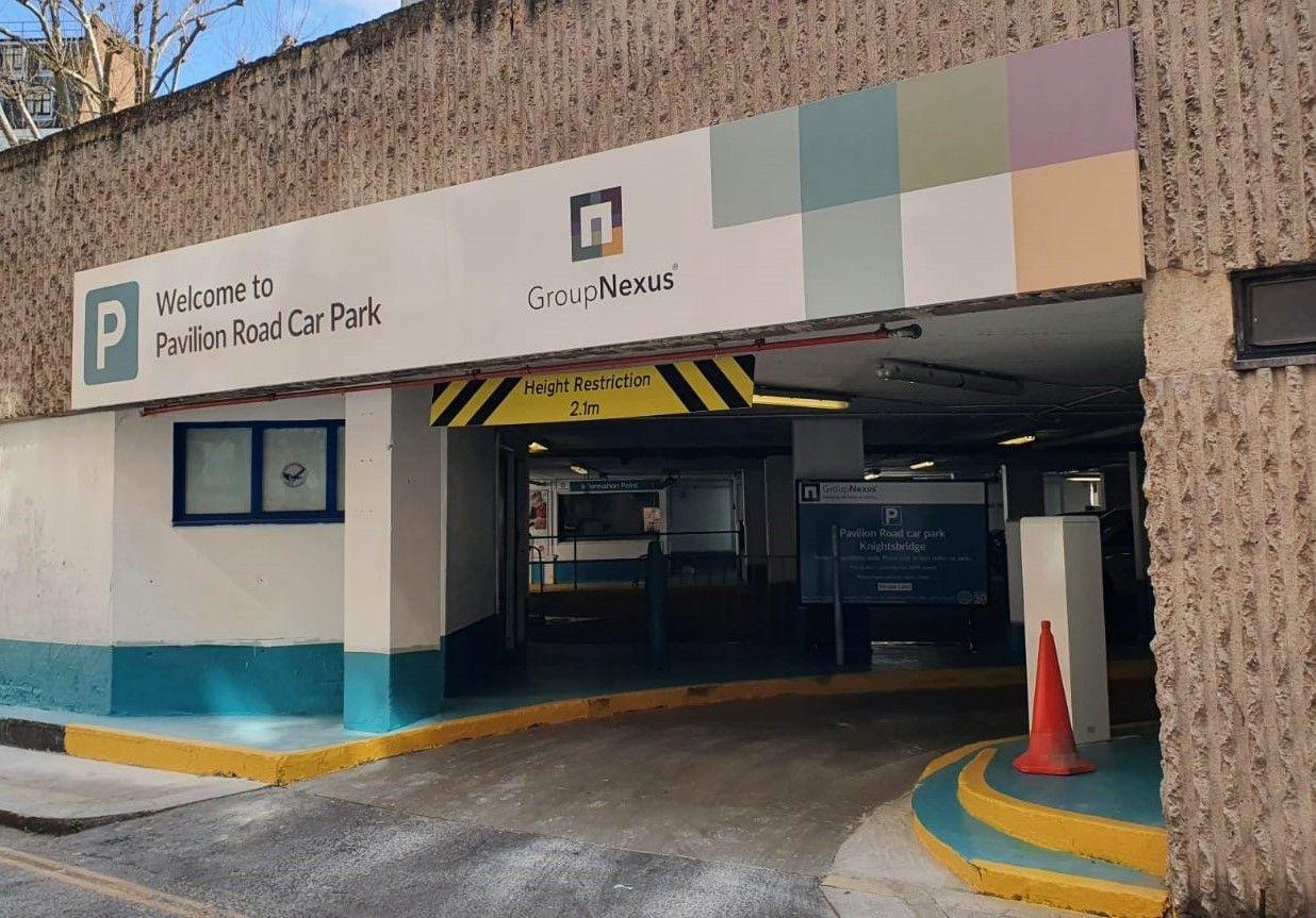
With a mission to develop and deliver cutting-edge technology and products that provide landowners with greater understanding about how their car parks are used and that better serve the drivers who use them, the newly combined entity required a new business to business brand identity and visual language. This design system needed to work effectively across print and digital, from hard signage to console and app interfaces.
Creative Clinic initially worked on a business to business branding strategy, helping the newly formed company to develop a brand proposition and positioning built around ‘delivering the future of parking’. With two separate businesses being brought together by the merger, it was essential to bring stakeholders on the branding journey, respecting the approaches and cultures of both teams. Through a series of workshops and on-boarding events, we guided the company directors and personnel through a process of brand implementation and understanding of how and why the new brand should be adopted.
The GroupNexus logo consists of a series of blocks, each representing a different aspect of the merged business offering. Together these combine into one solid square with a lowercase letter ‘n’ for Nexus (“a connected group or series of connections linking two or more things; a central or focal point”) formed at its centre by the negative space. This ‘vacant’ area is a representation of the parking spaces they manage, whilst the pixel-like feel reflects their positioning as a technology solutions company.


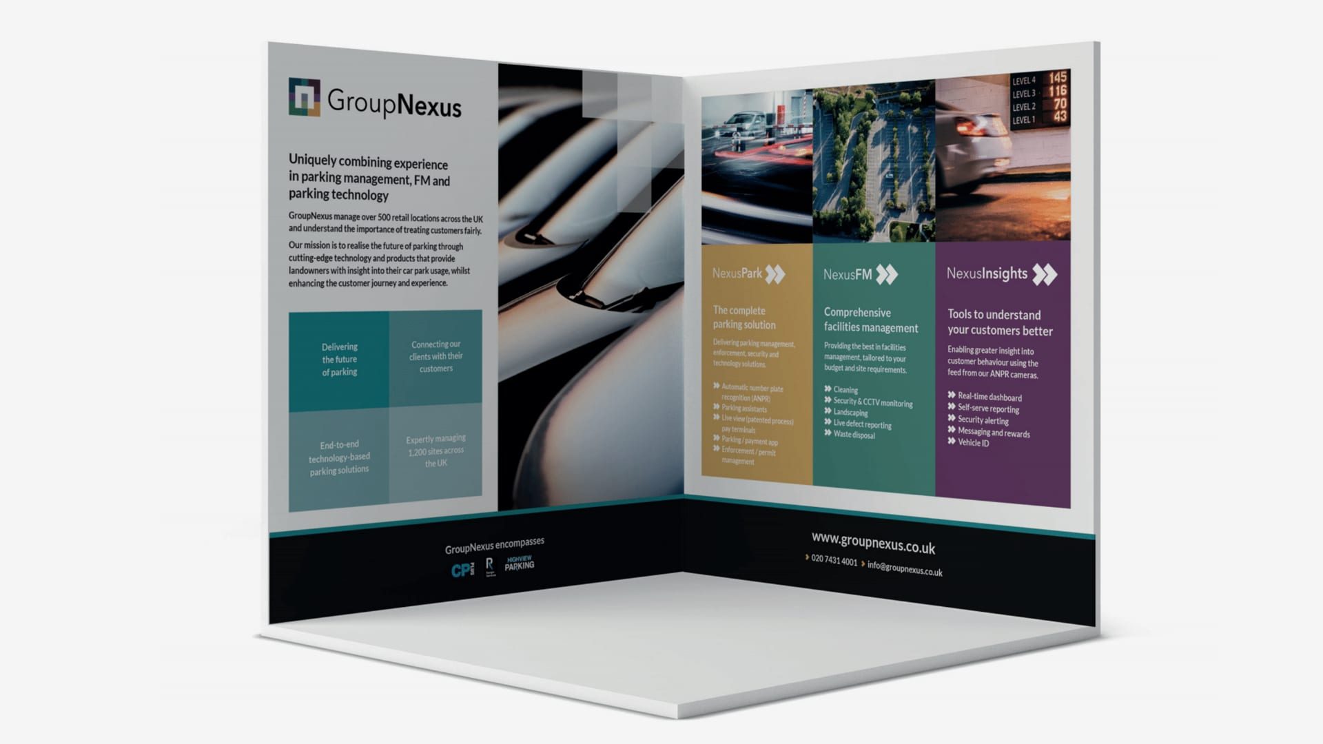
With GroupNexus as the umbrella brand, there are three distinct sub-brands / services that the company offers. Each has its own separate but connected identity, using colours from the master brand palette. It also borrows two of the corners from the master logo to use as a chevron-type symbol, in order to evoke a sense of vehicle, motion and moving forward. The individual squares and ‘three square corner chevron’ icons are applied across print and digital assets, forming a key part of the brand’s visual language.
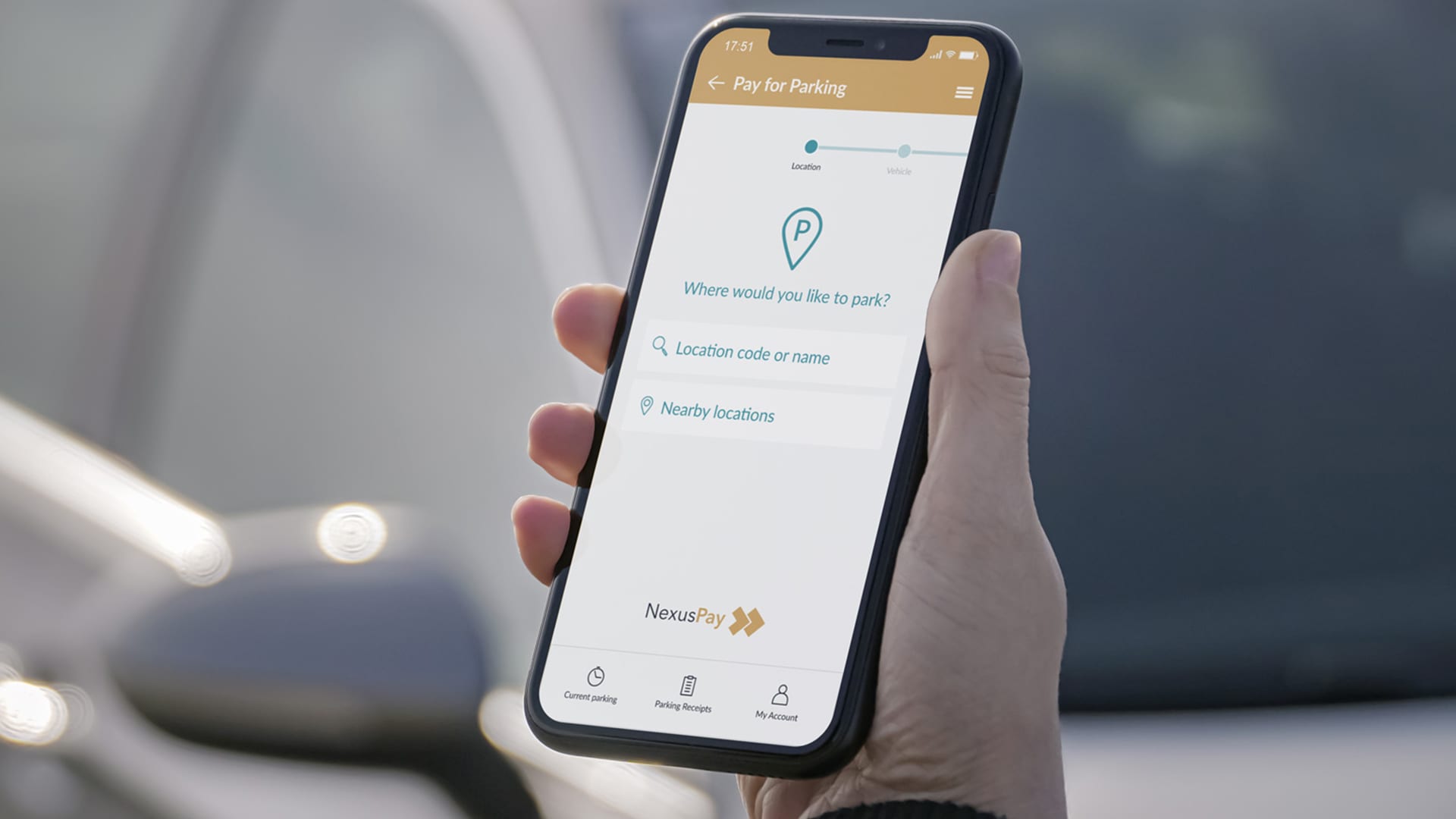
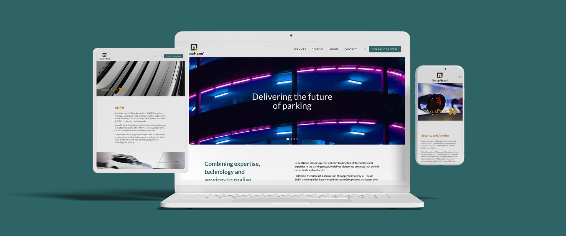
Creative Clinic has produced a wide range of brand assets, design and marketing collateral over a number of years. This includes website, brochures, payment console touchscreens, exhibition graphics, motion graphics, presentation templates, advertising, LinkedIn marketing campaigns and also interface design for their parking payment app.
